If you show a notification in the material design, the style makes no difference to the look of the notification. They all look the same as if you put no style there at all.
EDIT: Didn’t realise you were referring to the style kwarg in the Notification constructor. They are not currently applied in the Material Design theme, I’ll move this to Bug Reports (and modify the theme accordingly.)
For posterity:
Notifications are styled independently from other components. The rules are in theme.css where it says:
/* Notifications */
For example, I changed the colour of the message to the Primary colour by doing:
body>div[data-notify="container"]>span[data-notify="message"] {
  display: block;
  padding: 20px 0 0;
  font-size: 16px;
/*  color: #747474;  */
  color: %color:Primary 500%;
}
This gives me:
https://anvil.works/build#clone:YNAPW2LV4PSGXNY7=B2UEAFLDGZW3BANS7TSLQCLM
2 Likes
Yes I was 
Cheers.
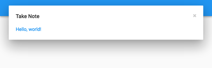
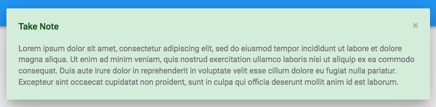
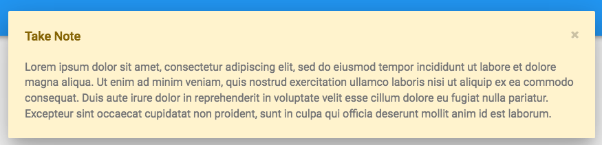
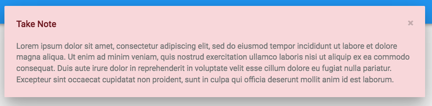
We’ve updated the Material Design CSS to style notifications like the images below. We’ll deploy tomorrow morning, and from then on new Material Design apps will have these styles.
Success
Warning
Danger
Info
Existing apps
As always with style changes, you’ll have to add the rules manually to the theme.css of existing apps, because auto-merging style updates with files you may have modified would cause all kinds of pain. So please add these rules to any relevant existing apps:
body>div[data-notify="container"].alert-success{
  background-color: #d4edda;
}

body>div[data-notify="container"].alert-success>span[data-notify="title"]{
  color: #155724;
}

body>div[data-notify="container"].alert-danger{
  background-color: #f8d7da;
}

body>div[data-notify="container"].alert-danger>span[data-notify="title"]{
  color: #721c24;
}

body>div[data-notify="container"].alert-warning{
  background-color: #fff3cd;
}

body>div[data-notify="container"].alert-warning>span[data-notify="title"]{
  color: #856404;
}
1 Like
We’ve deployed now, so new apps will have the styled notifications.
1 Like