Thank you for providing sufficient information to the question.
I don’t use Plotly, but I believe that the Plotly version 4 features, which include shapes, have not yet been incorporated into Anvil. Please see the recent post here.
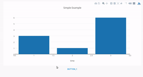
In the meantime one approach would be to simply use the Scatter object to draw your line wherever you want. The Anvil Plotly documentation shows a bar chart with a scatter overlay, and so you can work from that example to try things out.
In terms of updating the chart incrementally, you could create a new object that has your Scatter chart appended to your initial data. Then, reset the whole thing to show the updated chart (e.g., self.plot_1.data=my_new_data). Perhaps more experienced Plotly users have other ways of doing this.