We’re currently working on a showcase to demonstrate all the great dashboards you can build with Anvil. We will be showcasing examples we have built and some examples from the community. If you would like to contribute, we would love to hear from you!
Ideally, we are looking for dashboards with visually appealing ways of displaying data or dashboards on interesting subject matters.
If you’ve built a dashboard you’d like to share or think will inspire others, share a link, some screenshots or even a GIF!
These are dashboard-like (I can delete this post if this is not what you had in mind).
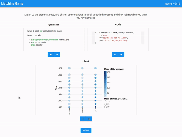
Grammar of Graphics Game
For those in my organization who are learning to make charts with code, I built a training app that helps folks understand a concept called “Grammar of Graphics”. Specifically, the application connects English statements about how data should be visualized, to the corresponding code and chart.
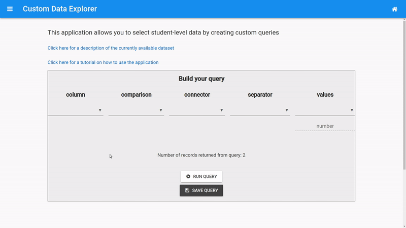
Data Explorer
This is a graphical query builder that allows staff to select student records that satisfy some pattern or criteria. Users can save their queries and also view and use baked-in examples. One hope is that this will help staff to learn the value of a well-defined research question.
This application gives a live and interactive view of consecutive and habitual absences for any school for which the user has access to (though their role and attributes). Notice that school-level measures can be clicked to reveal student-level details.
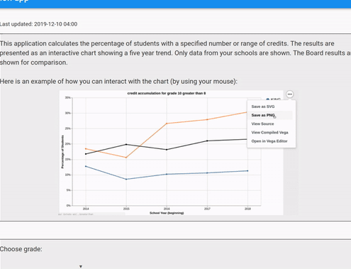
This is a perfect example of something that Anvil makes so easy. This app only took one day to put together. It is simply a set of filters that are used together to present an interactive chart. The chart reflects the percentage of accumulated student credits over time. When new criteria are chosen, new charts get added to the screen, making different views of the data easy for folks to compare. Here’s a GIF with some fake data: