What I’m trying to do:
I was creating a plotly plot server-side, until I realized I could use graph_objects in code. I moved my plotting function to the client code, and it created a really weird behavior with the hover templates. I had to change the figure definition to an array of Bar plots like in the docs instead of using the add_trace function like I was on the server, but other than that, I didn’t change anything about my code.
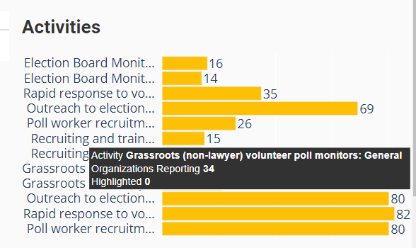
The plot from the server call (desired):
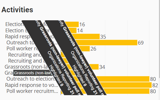
The plot from the client call (crazy):
Code Sample:
# Server side method
@anvil.server.callable
def get_overlay_bar(y, x1, x2, label, c1, c2):
  y = [f"{t}  " for t in y]
  fig = go.Figure(
    go.Bar(
      y=y,
      x=x1,
      orientation='h',
      showlegend=False,
      text=[f"{label} <b>{x[2]}</b><br>Organizations Reporting <b>{x[0]}</b><br>Highlighted <b>{x[1]}</b>" for x in zip(x1, x2, y)],
      hovertemplate = '%{text}<extra></extra>',
      hoverlabel=dict(
        bgcolor='#333232'
      ),
      marker=dict(
        color=c1
      )
    )
  )

  fig.add_trace(
    go.Bar(
      y=y,
      x=x2,
      orientation='h',
      showlegend=False,
      text=[f"{label} <b>{x[2]}</b><br>Organizations Reporting <b>{x[0]}</b><br>Highlighted <b>{x[1]}</b>" for x in zip(x1, x2, y)],
      hovertemplate = '%{text}<extra></extra>',
      hoverlabel=dict(
        bgcolor='#333232'
      ),
      marker=dict(
        color=c2
      ),
      textfont=dict(
        size=24
      )
    )
  )

  annotations = [
    dict(
      x=xi,
      y=yi,
      text=str(xi),
      xanchor='left',
      yanchor='auto',
      showarrow=False,
      font=dict(
        size=16
      )
    ) for yi, xi in zip(y, x1)]

  fig.update_layout(
    barmode="overlay",
    bargap=0.1,
    margin=dict(
      l= 0,
      r= 0,
      b= 0,
      t= 0,
      pad= 0
    ),
    geo_bgcolor='rgba(0, 0, 0, 0)',
    paper_bgcolor='rgba(0, 0, 0, 0)',
    plot_bgcolor='rgba(0, 0, 0, 0)',
    annotations=annotations,
    xaxis = dict(
      showticklabels=False
    ),
    yaxis = dict(
      tickmode='array',
      tickvals=y,
      ticktext=[f"{t[0:20]}...  " if len(t) > 21 else f"{t}  " for t in y]
    ),
    meta=y,
    font=dict(
      size=16
    )
  )
  return fig
Client Side Method
def get_overlay_bar(self, y, x1, x2, label, c1, c2):
    y = [f"{t}  " for t in y]
    # Specify the plots
    bar_plots = [
      go.Bar(
        y=y,
        x=x1,
        orientation='h',
        showlegend=False,
        text=[f"{label} <b>{x[2]}</b><br>Organizations Reporting <b>{x[0]}</b><br>Highlighted <b>{x[1]}</b>" for x in zip(x1, x2, y)],
        hovertemplate = '%{text}<extra></extra>',
        legendgroup = 1,
        hoverlabel=dict(
          bgcolor='#333232'
        ),
        marker=dict(
          color=c1
        )
      ),
      go.Bar(
        y=y,
        x=x2,
        orientation='h',
        showlegend=False,
        text=[f"{label} <b>{x[2]}</b><br>Organizations Reporting <b>{x[0]}</b><br>Highlighted <b>{x[1]}</b>" for x in zip(x1, x2, y)],
        hovertemplate = '%{text}<extra></extra>',
        legendgroup = 1,
        hoverlabel=dict(
          bgcolor='#333232'
        ),
        marker=dict(
          color=c1
        )
      )
    ]

    #Specify the annotations
    annotations = [
      dict(
        x=xi,
        y=yi,
        text=str(xi),
        xanchor='left',
        yanchor='auto',
        showarrow=False,
        font=dict(
          size=16
        )
      ) for yi, xi in zip(y, x1)]

    # Specify the layout
    layout = go.Layout(
      barmode="overlay",
      bargap=0.1,
      margin=dict(
        l= 0,
        r= 0,
        b= 0,
        t= 0,
        pad= 0
      ),
      geo_bgcolor='rgba(0, 0, 0, 0)',
      paper_bgcolor='rgba(0, 0, 0, 0)',
      plot_bgcolor='rgba(0, 0, 0, 0)',
      annotations=annotations,
      xaxis = dict(
        showticklabels=False
      ),
      yaxis = dict(
        tickmode='array',
        tickvals=y,
        ticktext=[f"{t[0:20]}...  " if len(t) > 21 else f"{t}  " for t in y]
      ),
      meta=y,
      font=dict(
        size=16
      )
    )

    # Make the multi-bar plot
    fig = go.Figure(data=bar_plots, layout=layout)

    return fig