Custom HTML templates
This feature is optional - you do not need to know HTML to use Anvil!
However, if you do know HTML, or employ a web designer who does, this reference will allow you or them to create a beautiful template into which you can easily drag-and-drop your Anvil components.
When creating a form, you can choose whether to make it a blank panel (a ColumnPanel), or choose a design template.
A template Form allows components to be dragged and dropped into several different places within the design: For example, a particular template might have a navigation bar, a title/heading, and a main body.
HTML slots and templating
An Anvil HTML template has one or more areas into which components can be dropped, called “slots”. HTML slots are created by adding anvil-slot or anvil-slot-repeat as an attribute to any element of your HTML.
A slot must have a name - this example declares an HTML slot called default.
<div anvil-slot="default"></div>When a component is dropped into an HTML slot, that component will automatically get a slot property indicating in which component it is nested:
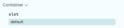
The slot property for a component
inside the default HTML slot
Old HTML templates made use of explicit drop zones, along with HTML slots, to define where components would land. However, drop zones are no longer necessary and we advise against using them anymore.
If you want to read more about how explicit drop zones worked, visit the Classic Editor docs.
Creating slots
The simplest way to create an HTML slot is by adding the anvil-slot attribute on an HTML element. Every time a component is dropped into a slot created with the anvil-slot attribute, it will get added inside that HTML element.
<!-- Each component added to the "default" HTML slot will be inside the same div with a lightblue border -->
  <div anvil-slot="default"
    style="border: 2px solid lightblue">
  </div>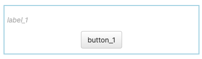
A label and a button inside the ‘default’ slot
Another way to create HTML slots is to use the anvil-slot-repeat. When anvil-slot-repeat is added to an element, this element will not appear on your page when the form is blank, but for every component added to that slot, a new copy of that element will be created, and the component will be added to the end of it:
<!-- Each component you drag and drop onto this "default" slot
     goes in a new div with a pink border -->
<div anvil-slot-repeat="default"
    style="border: 2px solid pink">
  </div>
Every component dropped into here
ends up in a new pink-bordered div.
If you don’t want your components to be added to the end of your anvil-slot-repeat element, you can also specify deeper wrapping. If there is an element with the attribute anvil-component-here inside your anvil-slot-repeat element, the component will go there rather than at the outside of the repeat.
In this example, we create a box with a pink border for each element, inside which is a box with a blue border, inside which is our component:
<!-- Each component you drag and drop onto the "default" slot
     goes in a new blue-bordered div, inside a pink-
     bordered div. -->
<div anvil-slot-repeat="default"
    style="border: 2px solid pink; padding: 5px">
    <div style="border: 2px solid lightblue">
      <div anvil-component-here></div>
    </div>
</div>
If you don’t want your components to be added to the end of your anvil-slot-repeat element, you can also specify deeper wrapping. If there is an element with the attribute anvil-slot (with no name assigned) inside your anvil-slot-repeat element, the component will go there rather than at the outside of the repeat.
In this example, we create a box with a red border for each element, inside which is a box with a green border, inside which is our component:
<!-- Each component you drag and drop onto the "default" slot
     goes in a new blue-bordered div, inside a pink-
     bordered div. -->
<div anvil-slot-repeat="default"
    style="border: 2px solid pink; padding: 5px">
    <div style="border: 2px solid lightblue">
      <div anvil-slot></div>
    </div>
</div>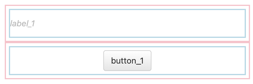
Every component dropped into here ends up in
a blue-bordered div inside a pink-bordered div.
Designer prompts and placeholders
You can use anvil-designer-only to include prompts to the designer that will not appear in the final app. Adding the anvil-designer-only class to an element makes it invisible when the app is run.
<!-- The first div will only be visible while editing your app in the designer -->
<div class="anvil-designer-only" style="color: gray; font-style: italic;">
     Drop components below
</div>
<div anvil-slot="default" style="border: 2px solid lightblue; padding: 5px"></div>
You can also add placeholders that will show up if nothing is added to a slot. You just need to add anvil-if-slot-empty=<name-of-empty-slot> to the placeholder element. For example, in the code block below, we’ve created a placeholder element that will show up only if the title slot is empty.
<div anvil-slot="title">
    <div anvil-if-slot-empty="title">Drop a title here!</div>
</div>
The placeholder disappears when a component is dropped inside the slot.
Drop zones
When you drag and drop a component onto your form, Anvil uses the position of your mouse pointer to work out which slot the component will land in. It does this by examining whether the pointer is over a drop zone you have declared.
If you have not declared any drop zones, or the pointer is not over a drop zone, a dragged component will land in the slot called default (an element with the anvil-slot-xx="default" attribute). You can change a component’s slot in the Container Properties section of its Properties.

The slot property for a component
inside the title HTML slot
However, editing each component’s slot by hand is awkward. If you want to make your template as easy to use as the Anvil sample templates, you need to declare your own drop zones.
Each of the following explanations is accompanied by an example piece of HTML. Try copying and pasting this HTML into the html property of a Custom HTML form, then drag and drop some components onto the form and see what they do.
Simple drop zones (anvil-drop-slot)
If you add the attribute anvil-drop-slot="my-list" to an element, then if a component is dragged and dropped over that element, it will be added to the end of slot named my-list (an element with the anvil-slot-xx="my-list" attribute). While dragging over the anvil-drop-slot element, it will be highlighted.
In the example below, if you drag a component over the + Add to nav bar text, that text will be highlighted. If you drop the component on that text, the component will appear at the end of the slot named “my-list” (in this example, the div with the attribute anvil-slot-repeat="my-list"), with a red box around it.
<div anvil-slot-repeat="my-list"
     style="border: 2px solid red">
</div>

<!-- If you drop a component onto this element,
     it will be added to the "my-list" slot -->

<div anvil-drop-slot="my-list" class="anvil-designer-only">
 + Add to nav bar
</div>
Default drop zone (anvil-drop-default)
Normally, if the user drags and drops over an element that is not a drop zone (that is, it has none of the anvil-drop-xxx attributes discussed here), the whole form will be highlighted while dragging, and the component will be added at the end of the “default” slot.
You can set a default drop zone with the anvil-drop-default attribute. This is the drop zone that will be highlighted while dragging and will specify where components should land if the user drops a component on an element that is not a drop zone. You can also add other drop-zone attributes to this element.
In this small modification of the last example, we add the anvil-drop-default attribute to the “+ Add to nav bar” drop zone. The “+ Add to nav bar” drop zone will now be highlighted while dragging, rather than the whole Form, and components will be placed inside the “my-list” slot by default.
<!-- If you drop a component almost anywhere,
     it will be added to the "my-list" slot -->

<div anvil-slot-repeat="my-list"
     style="border: 2px solid red">
</div>

<div anvil-drop-default
     anvil-drop-slot="my-list"
     class="anvil-designer-only">
 + Add to nav bar
</div>
Note that the anvil-drop-default must be a top-level element (not the child of any other element). You will therefore often want to use it with anvil-drop-redirect (see below).
Drop into sequence (anvil-drop-here)
If you add the anvil-drop-here attribute to an element, then if a component is dropped on that element, it will be inserted into the same slot as the drop zone, at the same index. (Anvil scans upwards in the document until it sees an anvil-slot-repeat attribute, then uses that slot.) When dragging, the element with the anvil-drop-here attribute will be highlighted.
This example creates a <div> for each component in the my-list slot. Above each div is a 10-pixel-thick red bar - if you drop a new component on that red bar, it will be inserted above the red bar. If you drop a component onto green bar at the bottom, it will be added at the end of the my-list slot.
<!-- Allow components to be inserted at a specific position in a list
     by dropping them in a specific location -->
<div anvil-slot-repeat="my-list">
  <div anvil-drop-here
       style="border-top: 10px solid red;">
  </div>

  <div anvil-slot></div>
</div>
<div anvil-drop-slot="my-list"
     anvil-drop-default
     style="border-top: 10px solid green">
</div>
Snap to nearest drop zone (anvil-drop-redirect)
This example is the same as the last one, except that everything is wrapped in an element with the attribute anvil-drop-redirect=".my-drop-zone". This means that, wherever you drag and drop over this element, Anvil will act as though you are dragging or dropping over to the nearest drop zone matching the CSS selector ".my-drop-zone". This means that insertion will “snap” to the nearest point in the list, in a natural way.
<!-- Wherever you hover over this container,
     you snap to the nearest element with
     the 'my-drop-zone' class -->

<div anvil-drop-redirect=".my-drop-zone"
     anvil-drop-default>
    <div anvil-slot-repeat="my-list">
      <div anvil-drop-here class="my-drop-zone"
           style="border-top: 10px solid red;"></div>
      <div anvil-slot></div>
    </div>
    <div anvil-drop-slot="my-list" class="my-drop-zone"
         style="border-top: 10px solid green">
    </div>
</div>
If you include a container element in your list - such as a ColumnPanel or a Link - then components can be dragged and dropped into that container as normal. The drop zones only affect drag-and-drops outside a container.)
You can also anvil-drop-redirect to any sort of drop zone: anvil-drop-slot, anvil-drop-here, anvil-drop-container, or even to another anvil-drop-redirect.
Snap to nearest container (anvil-drop-container)
If you set the anvil-drop-container attribute on an element, then when you drag over that element, Anvil will find the nearest container within that element, and act as though you are dragging or dropping on that container.
This is convenient if your layout expects to use a small number of container components (such as ColumnPanels) to give you finer drag-and-drop control over the arrangement of your components. For example, an empty ColumnPanel is a very small target to hit with drag-and-drop, but the anvil-drop-container attribute allows you to offer a large target area, so users naturally drop new components inside the ColumnPanel.
<!-- This is a simple "card-style" layout. The idea is that
     you drop ColumnPanel components into this layout, and
     put your content inside them. Unless you drag something
     precisely onto one of the red separators, Anvil will
     place your components into the nearest card. -->

<div anvil-drop-container
     anvil-drop-default
     style="background: lightgrey">

  <div anvil-slot-repeat="cards">
      <div anvil-drop-here
           style="border-top: 10px solid red">
       </div>

       <div anvil-slot
            style="background: white;
                   margin: 5px auto;
                   max-width: 600px;
                   box-shadow: 2px 2px darkgrey">
       </div>
  </div>

  <div anvil-drop-slot="cards"
       style="text-align:center; padding:20px;">
    <div>
      + Drop a ColumnPanel here to make a new card
    </div>
  </div>
</div>anvil-drop-container="<css selector>". This will drop into the nearest Anvil container that matches the specified CSS selector (rather than the nearest container inside the anvil-drop-container element). This CSS selector must end with .anvil-container in order to match an Anvil container.Fallback
An element can have multiple anvil-drop-xxx attributes. If one does not match (eg there is no matching container for an anvil-drop-container, or no match for the CSS selector in an anvil-drop-redirect), the next attribute takes effect.
The attributes take effect in the following order:
anvil-drop-containeranvil-drop-redirectanvil-drop-hereanvil-drop-slot
If there are no more attributes, we keep looking upwards in the HTML (going to the parent of each element in turn). If we hit the top of the HTML, we look for an anvil-drop-default element. If we can’t match that element, we return to the default setting: highlighting the whole Form and dropping a component at the end of the default slot.
Putting it all together
Below is an example that puts together everything we’ve learnt so far. It’s a simple “card-style” layout. You drop ColumnPanel components into this layout, and each of them creates a card. You then drop components inside them.
- We have a repeating element (
anvil-slot-repeat) with a drop-shadow effect for each component in thecardsslot. - In each repeat, there is a drop zone for inserting a new card at that position (
anvil-drop-here). - At the bottom, there is a drop zone for adding a new card at the end of the list (
anvil-drop-slot). - If we drop anywhere else (the zero-size
anvil-drop-defaultelement), we drop elements inside the nearest container in our card stack (anvil-drop-container), or if there is no matching container, we redirect to the “new card” drop zone (anvil-drop-redirect, following the fallback rules). - When we run the app, all our guidelines disappear (
class="anvil-designer-only").
<div class="cards"
     style="background: lightgrey;
            padding: 5px">

  <div anvil-slot-repeat="cards">
      <div anvil-drop-here
           class="anvil-designer-only"
           style="padding: 7px;
                  border: 1px dashed darkgrey;">
       </div>

       <div anvil-slot
            style="background: white;
                   margin: 10px auto;
                   max-width: 600px;
                   box-shadow: 2px 2px darkgrey">
       </div>
  </div>

  <div anvil-drop-slot="cards"
       class="new-card anvil-designer-only"
       style="border-top: 10px solid green">
    <div style="background: white;
                margin: 5px auto;
                max-width: 600px;
                box-shadow: 2px 2px darkgrey;
                padding: 10px;
                text-align: center">
      + Drop a ColumnPanel here to make a new card
    </div>
  </div>
</div>

<div anvil-drop-default
     anvil-drop-container=".cards .anvil-container"
     anvil-drop-redirect=".new-card">
</div>
Do you still have questions?
Our Community Forum is full of helpful information and Anvil experts.